Revolutionizing workflows for leading creative teams
Joining the PhotoShelter team after their B2B offering proof of concept was debuted, I was able to help develop the product into a beloved and irreplicable tool for creative teams. It grew from a few dozen organizations to thousands, dominating the sports and university markets and keeping an exceptional 96%+ retention rate.


How I took on the DAM space
A study of building a product and the user empathy it requires to do it right
Understanding the product and our users

Being new to the world of B2B, SaaS, and cloud file storage and management, there was a lot to be learned. Sure, there was plenty to be gleaned from learning about the tech behind it and how the space has evolved over time, but from the customer’s perspective, most of that didn’t matter. All that mattered was what was right in front of them and how it could make their lives easier.
From the start, I evaluated the PhotoShelter for Brands product (previously known as Libris) as a first-time user would experience it. I documented the points of confusion in UX, copy, and marketing using eye tracking, audio, and visual recording.
What I found was an ecosystem of apps that don’t share a common look, voice, or care for the user. A user could find themselves in a whole new app with a single click with no explanation as to where they were or why things changed. Every screen had a significant learning curve and treated the product as a repository of individual, unrelated features instead of focusing on workflows or anything beyond one user type.
Every new organization required significant hands-on time with a customer service specialist to get up to speed and their library set up for use. This was a clear place where an even slightly improved UI and UX could make a huge impact.

Creating a network of trust
Combing over years of past customer service tickets and sales feature requests, they mirrored most of my assumptions on usability and added many more points of friction in the app. This painted a picture of what needed to be worked on, but mostly only on items that customers were taking the time to point out to us.
In order to fully understand our users, we decided to get up close and personal. We created a Customer Council of users: an ever-evolving group of volunteer customers in a variety of verticals and locations whom we would regularly talk and test with as time went on and the product evolved.
This allowed us unparalleled levels of transparency as we worked with the users to gradually understand the details of their workflows, their organizations’ workflows, and even their end-user’s workflows. The more we learned about them, the more we were able to see common trends in usage and better anticipate not only what they needed in the near future, but also how our newer technology could impact their business years later.

Visualizing the user’s world
To start, we interviewed each org for at least one 60-minute session, mapped their organizational structures, workflows, metadata, permissions, and so, so much more.
As we came to understand each user and how that user interacted with their coworkers within and without our product, the easier it was to start creating user and organizational profiles. Finding these repeating patterns and commonalities in similar and disparate verticals created dramatic efficiencies when making future features. Also, we could see how careful additions to our service might impact other divisions within the same company.
When prioritizing what work or features needed to be done first, it was incredibly efficient to be able to point to a profile and see exactly what the impact and reach would be.


Understanding the users’ workflows before, during, and after the files were in our system was vital to figuring out where we could make the most impact. No two organizations were the same, but there could be multiple similarities in which a single new feature could make a world of difference.
For example: we found that if the social media team wasn’t a totally different team from the person in control of these assets being held in our system, they would almost always be welcomed into the asset library as an editor. Similar to people on a different team, they usually had little to no access whatsoever and possibly even have no communication with the Library owners at all.
(In some cases, the same organization’s social media team would buy their company’s own images from Getty instead of working with their own organization’s photo department.)
In that case, if we were to create a feature that focused on sharing to social media, we could fairly confidently see what the immediate impact to our current users would be and where it may be more gradual. We could further break it down when we knew what other tools and services they use to see where we might be able to capitalize on a feature gap and simplify their workflow by keeping them within our ecosystem.


Being able to get a snapshot in time of a team’s workflow not only helped our current understanding of their process, but it also helped us to understand how their needs evolved over time and what factors contributed to that. It could be anything from a change in budget to simply not knowing that other efficiencies could or did exist.
If the efficiencies did already exist, we could attempt to understand why they were unaware of it and how we might’ve been able to help others who were be in the same situation. If the efficiencies didn’t exist, how might we be able to innovate and make a real improvement to our offering and possibly even create something novel in the DAM space?
By the end of the initial research effort, we knew not only what needed to be improved on the product in the short or long term, but also our users’ sentiments about our company, technology, interface, branding, marketing and sales effectiveness, and even how to empower them within their own companies. What started as an initiative to understand how our users utilized our product resulted in tangible information to act upon across all departments at PhotoShelter and paved the way for the next 6 years of product improvements and steady growth.
Practicing and refining the process
The number of times the design process changed over time was substantial, but that’s how it should be with a healthy process of growth. Design is fluid and ever-changing with styles, opinions, constraints, and new capabilities. The process needs to adapt accordingly, and as long as it continues to identify and support the user while being at harmony with the stakeholder’s needs, product management’s goals, and development’s restrictions and aspirations, then it is on the right track.
User Research

Designs & Spec Documents

Userflows

Post-Mortems & Analytics
What we did with that information and process
In the years that followed, these were just some of the initiatives we planned, designed and implemented:
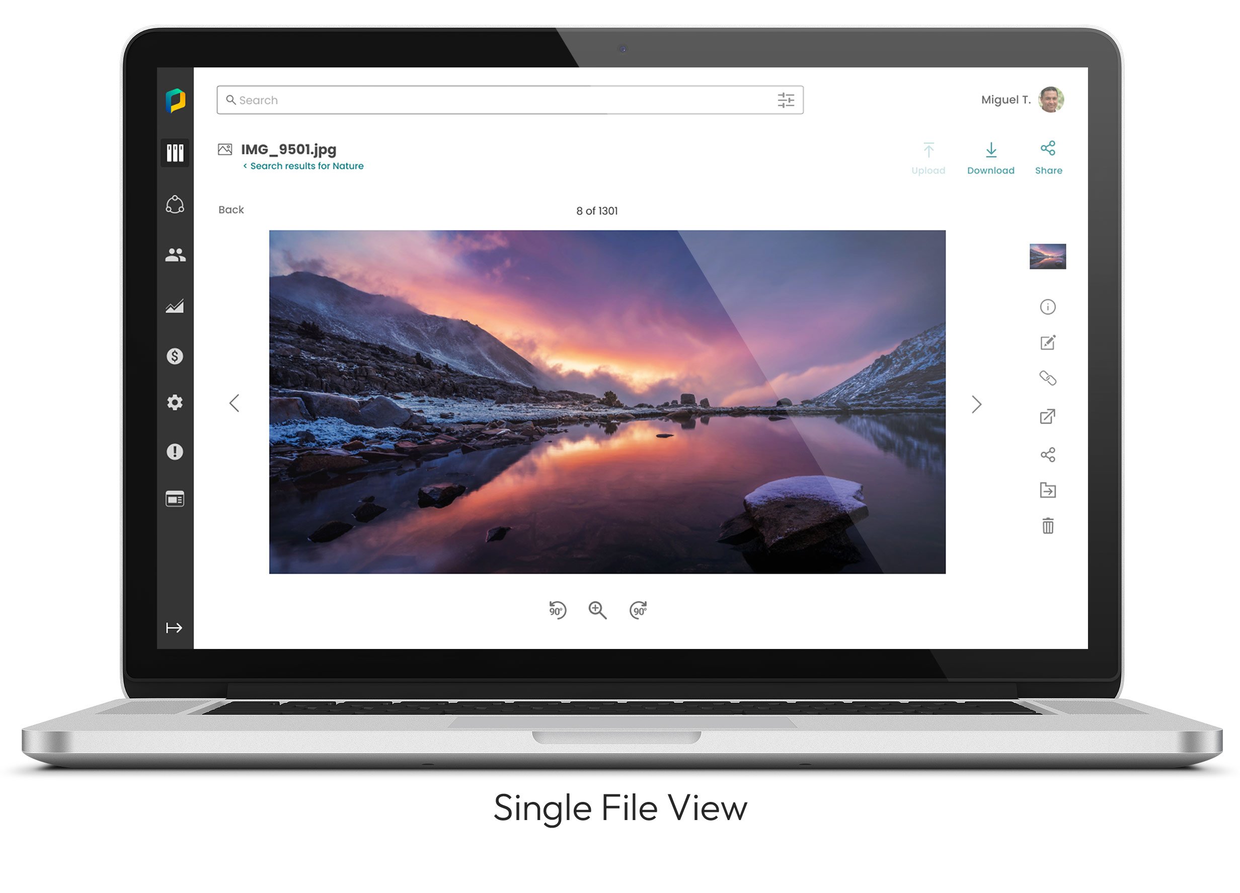
Reworked the search experience for all users, making it mobile-optimized and significantly easier to use, reducing time to find higher-quality results by 500%
Remade the concept of ‘Lightboxes’ into ‘Workspaces’. This allowed users to easily upload assets, share with others, and customize its workflow to meet each team’s needs in a collaborative space. This resulted in an exponential increase of users staying within our ecosystem instead of moving assets out to third-party platforms. This became one of the single most celebrated features PhotoShelter ever launched
Designed the system in which one parent account could house multiple library accounts with individual security preferences, leading to a larger enterprise-level product offering
Plotted out and designed the implementation for integrating AI recognition of objects, people, logos, etc., into our system, dramatically increasing metadata usage while decreasing effort to manually tag
Streamlined the typography, iconography, copy, and overall brand voice to use a singular style across the entire company
Clearly defined the visual differentiations between container types and file types in order to reduce the learning curve and increase general visual appeal
Expanded and refined the permissions system to allow for more flexibility and clarity when sharing content
Designed the native iOS and Android apps for all user types to efficiently download and traffic content within each ecosystem
Focused on meeting AA accessibility guidelines for all facets of our products, surpassing all of our competitors in this respect
Created dozens of general and customized integrations with other apps and services, such as Adobe, Slack, Wordpress, and many more. This allowed our DAM to fit neatly into almost any existing workflow
Outlined the near-term and long-term functionality of users consuming their own analytics, replacing a very slow and costly legacy system
Designed the system and look of notifications, toasts, and emails to users to create a cohesive and communicative experience
Redesigned and refined the technical range of the PhotoShelter Desktop Application: a native desktop app that allowed for rapidly syncing large numbers of files with our system
Created a new structure for managing and implementing metadata in the library across all files and metadata types, making it easier for users to understand and control
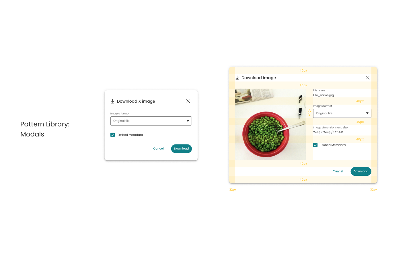
Redesigned batch downloading to be mobile-responsive with an enhanced and clear experience for everyone
Overhauled the product’s wayfinding, making the user’s current location in the file system apparent and easy to use, greatly reducing user confusion and abandonment
Reworked the Image Expiration system to be more apparent to users and customizable to administrators in order to more easily control assets in a volatile world of licensing
Standardized the user testing and research process as well as the dissemination of that information to the entire company
Created an official design process and worked with dev to integrate it with their system
Worked with dev to create a component library for more rapid development and execution
Navigating the growth
With significant YoY growth, over $18MM in rounds of investment and the purchases of the UK DAM Third Light and social app Socialie, PhotoShelter is uniquely positioned to continue to dominate in the international DAM market.
Having been in charge of the product design team through these changes, across time zones, during a pandemic, I know the team l left in charge features some of the smartest, and most talented designers working there to date, and they will continue to make the product amazing.
